| Role | Duration | Tools | Type |
|---|---|---|---|
| UI/UX | March – May 2025 | Figma | Academic Project |
Redefining how people order - visually, playfully, and intuitively.
An ecosystem of interactive ordering experiences designed for Got Tea’s in-store tablets.
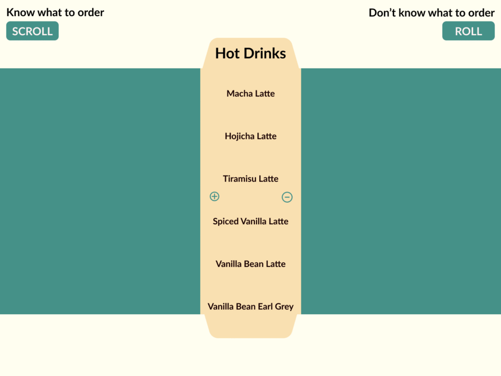
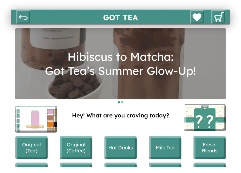
Instead of a single interface, the system explores three connected approaches – Visual Builder, Roll your Order, and Card based layout Ordering – a system that lets users choose how they want to interact, based on their mindset or mood in that moment.
Why it Works?
Adapts to all users
from first-time visitors to loyal regulars.
Balances play and clarity
interfaces range from fun to functional
Let's go back to how it all started...
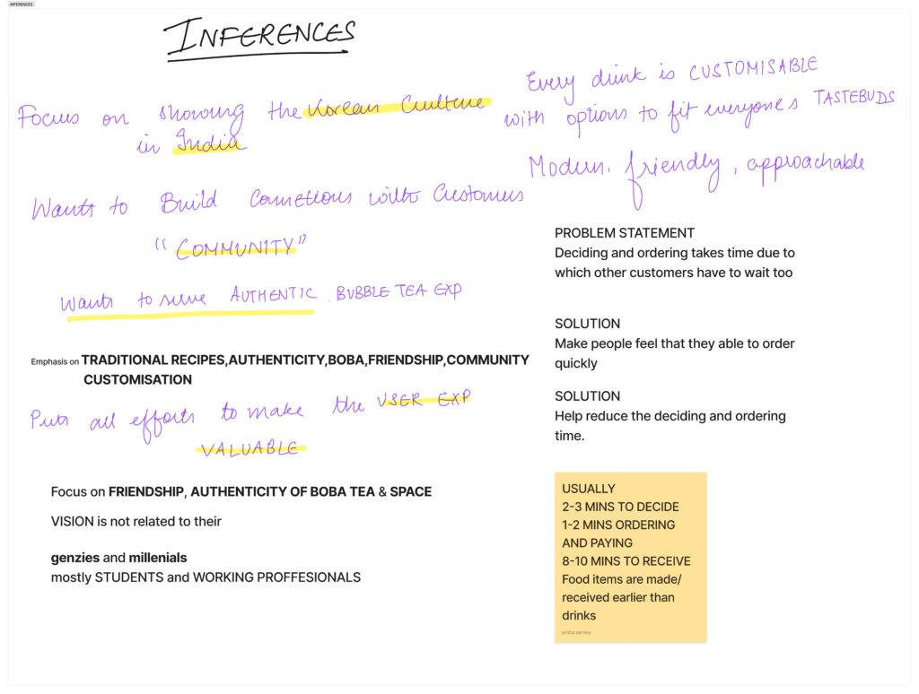
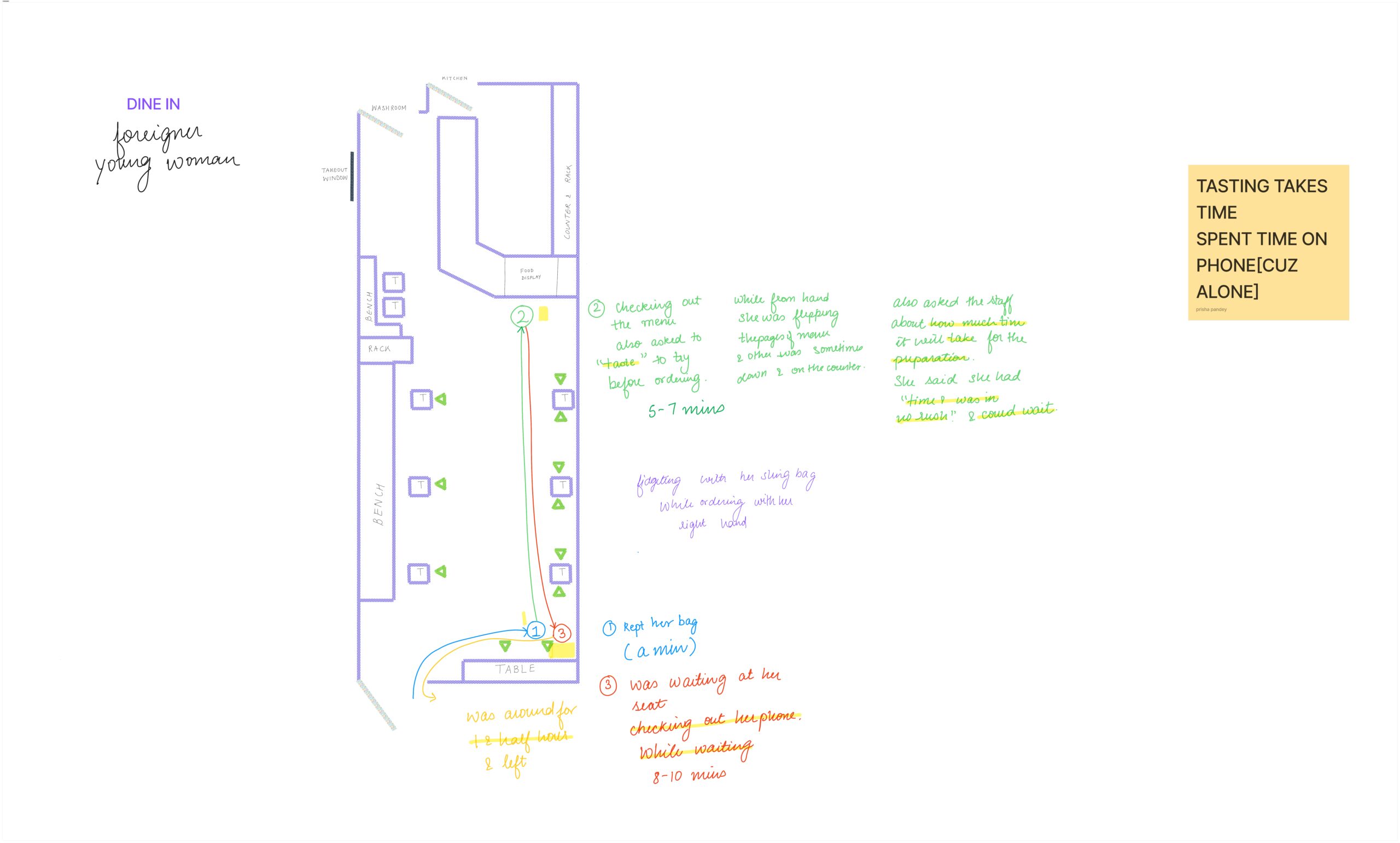
The project began with one key observation: customers at Got Tea cafés often spent too long choosing their orders.
The goal was to make the ordering process faster, more intuitive, and more delightful.
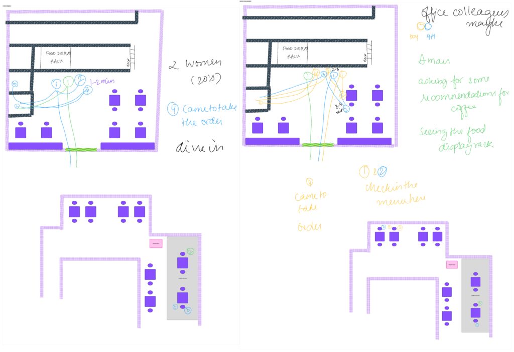
Through user observations and empathy mapping, I found two main user groups: curious first-timers, who needed help understanding the menu, and regular visitors, who wanted quick and easy reorders
Research and key Insights

Concepts
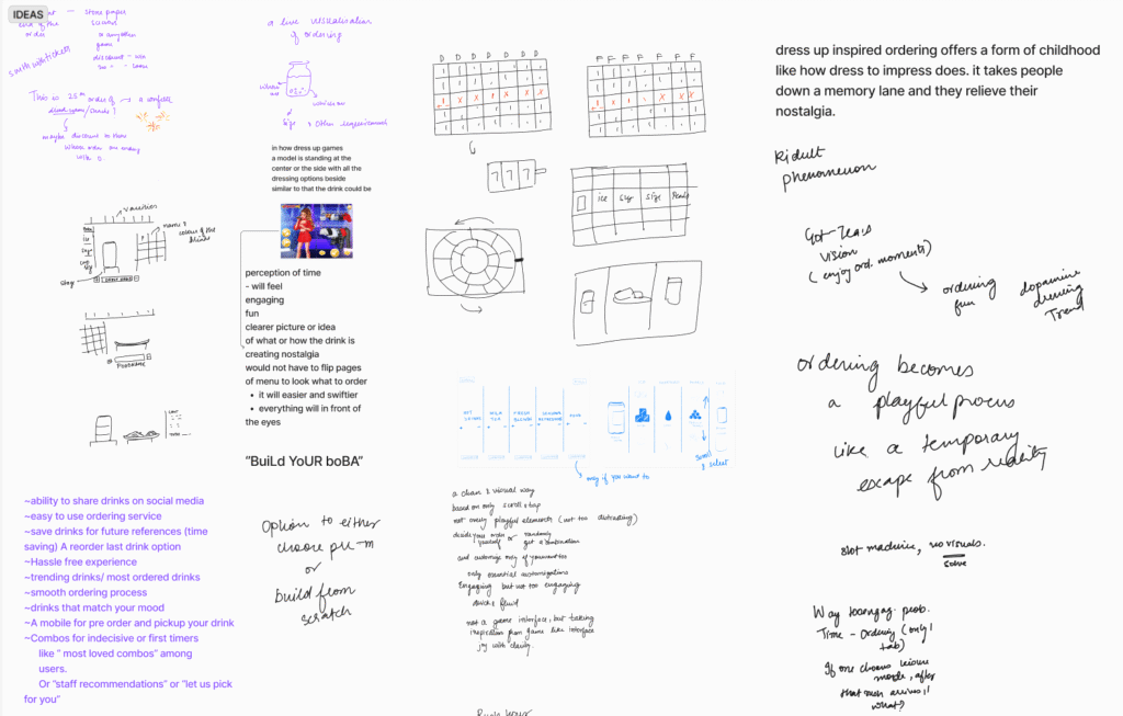
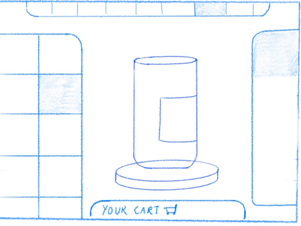
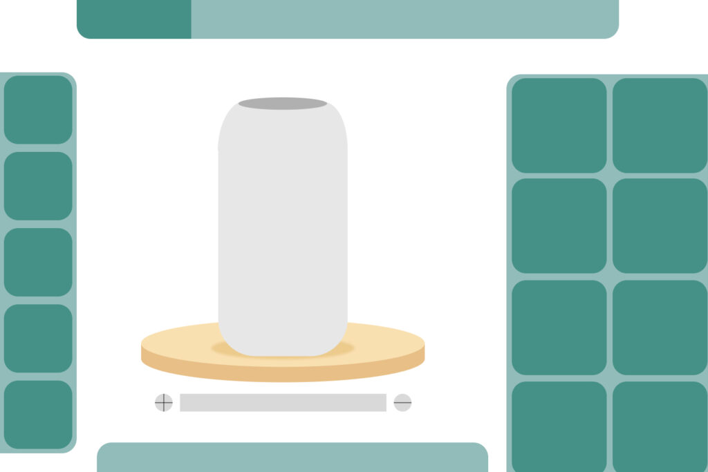
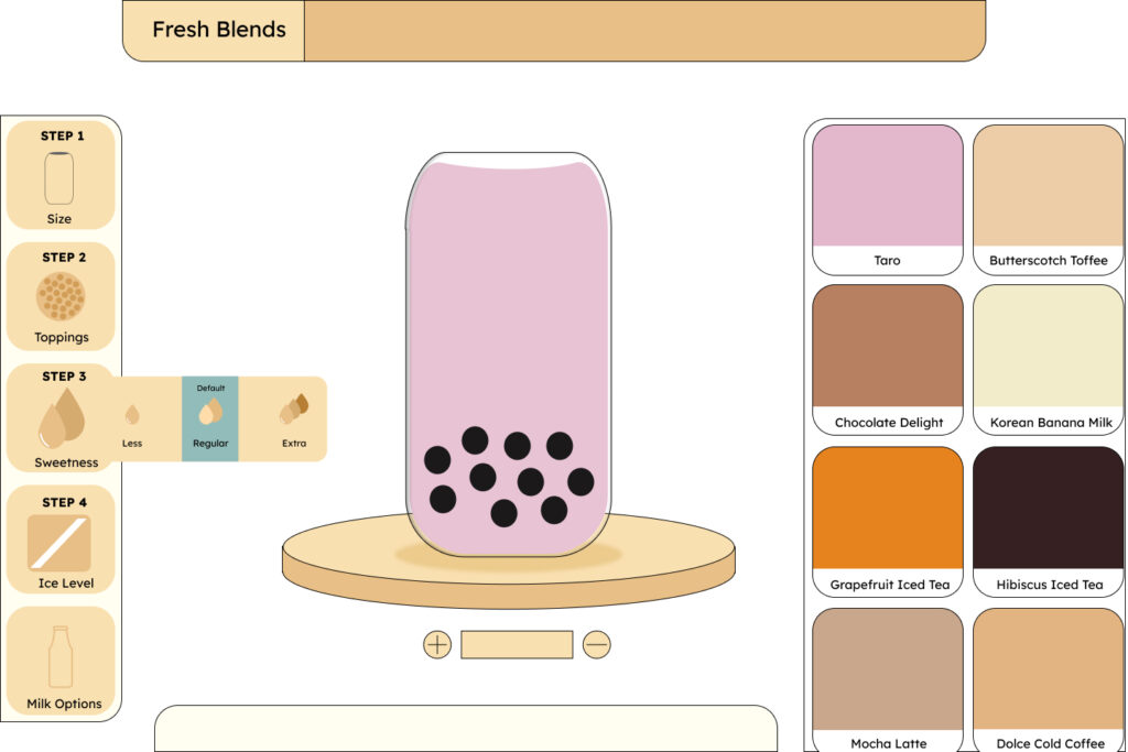
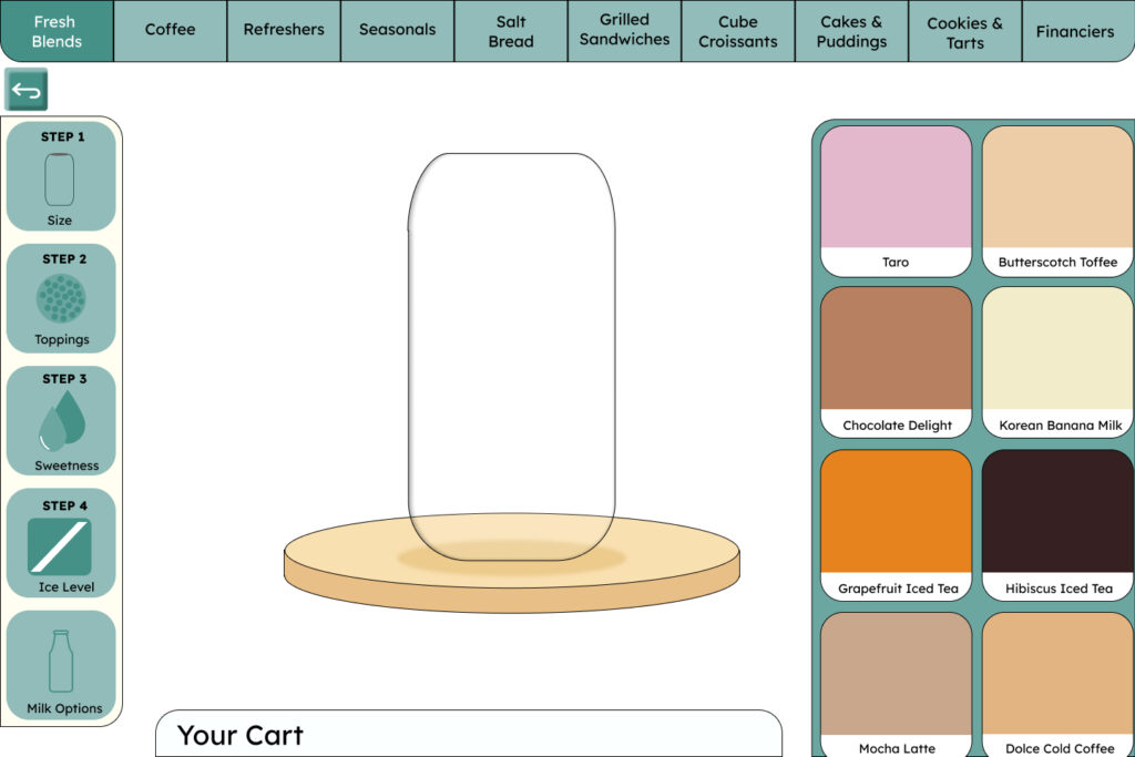
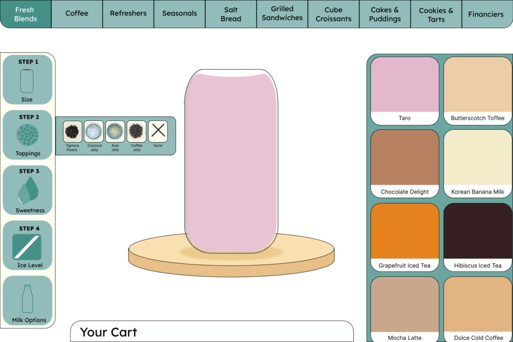
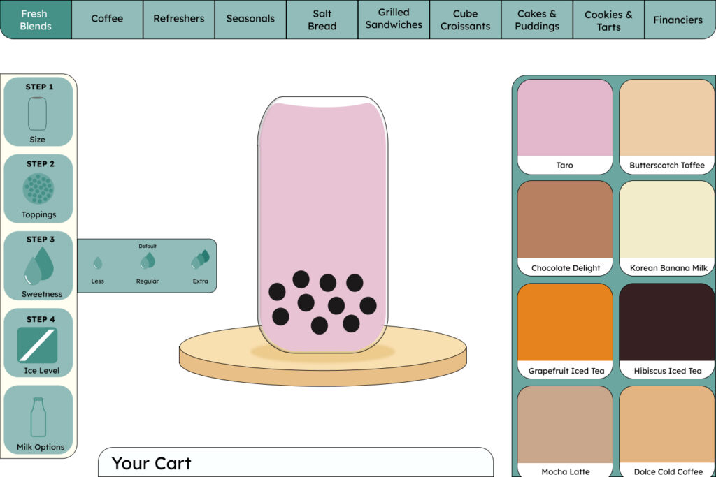
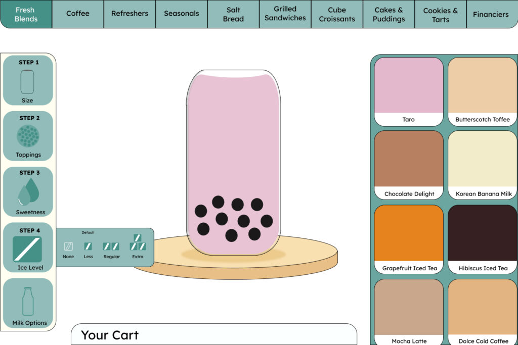
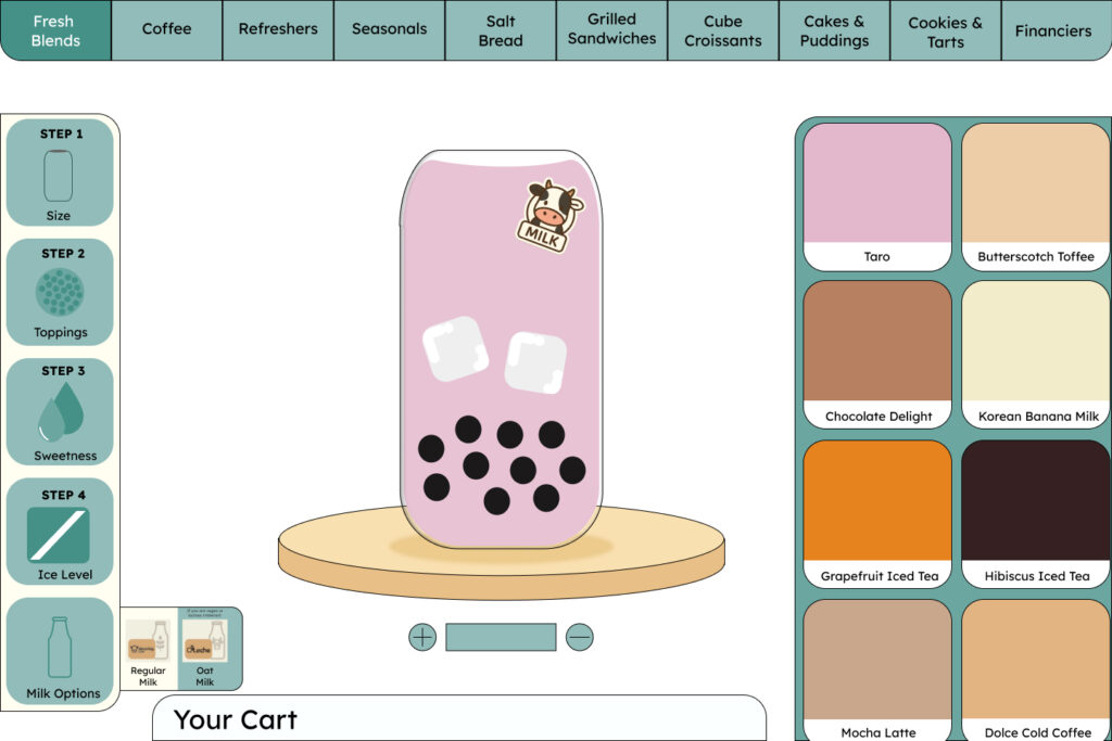
Visual Builder Interface (Dress-up Inspired)
A playful, game-like interface inspired by dress-up and customization games.
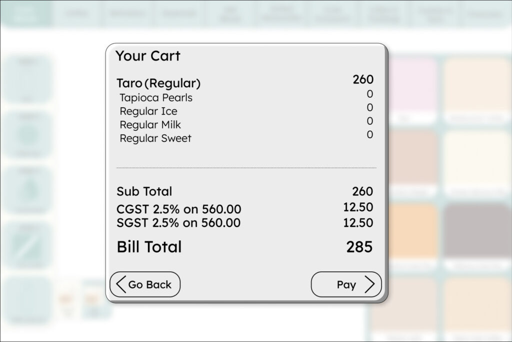
Users could visually build their bubble tea step-by-step – selecting base, flavor, toppings, and ice/sugar levels in a fun, drag-and-drop style, reducing the intimidation of too many choices.
Key Element: Playful animations and ingredient previews.
Learning: Great for engagement, but slightly time-consuming for quick orders.
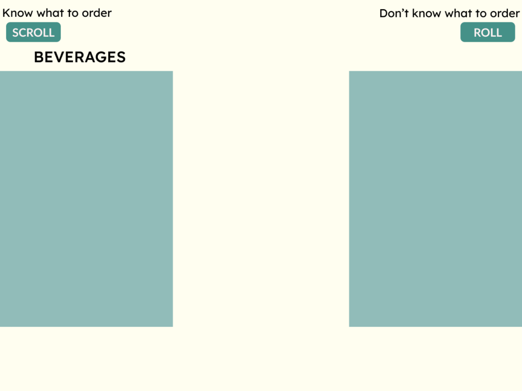
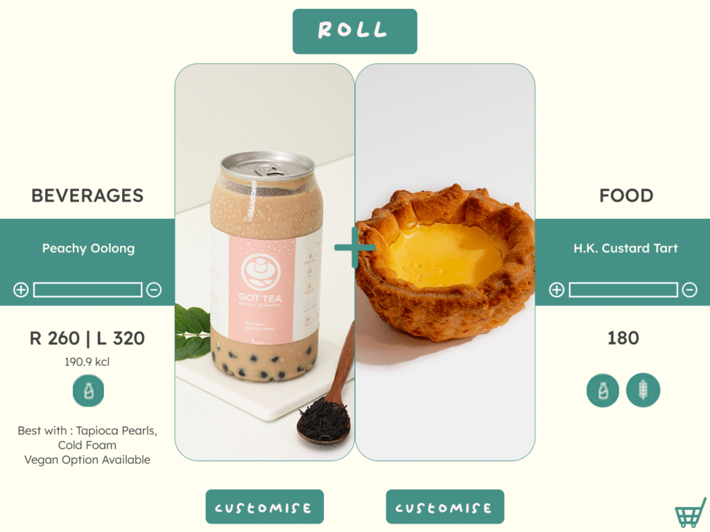
Roll Your Order
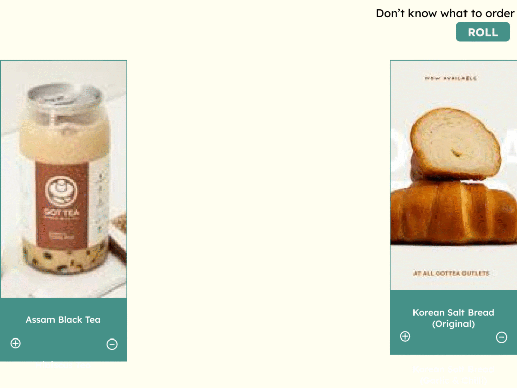
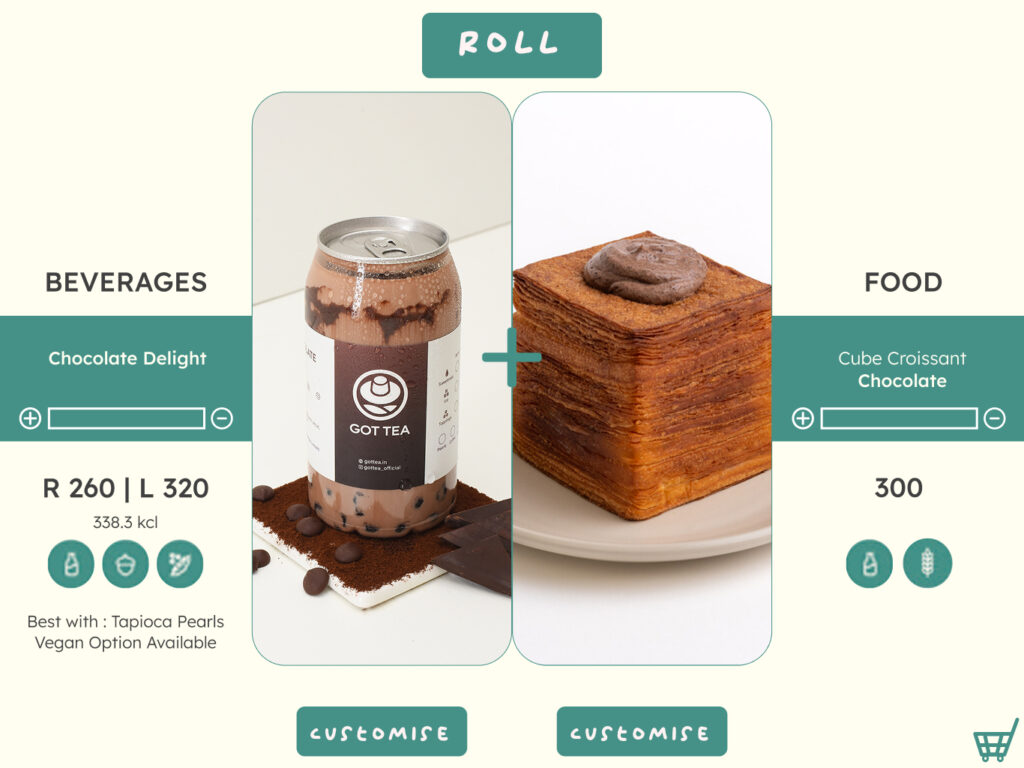
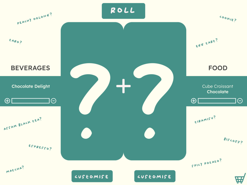
Helps indecisive users discover curated combos with a swipe.
Also could be like a dare among friends, where they could decide what others must order as a challenge, by this way they are being introduced to new options.
Key Element: A dual-pane layout where beverages and food pair suggestions appear side by side – allowing users to customize or add-on items instantly. The interface adapts to user behavior, promoting combos for regular users and detailed options for new ones.
Learning: The side-by-side pairing approach simplified choices and encouraged exploration, but required refining visual hierarchy to maintain focus and clarity.
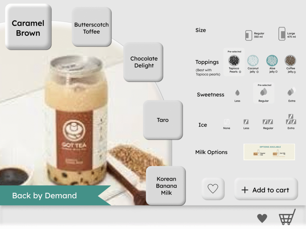
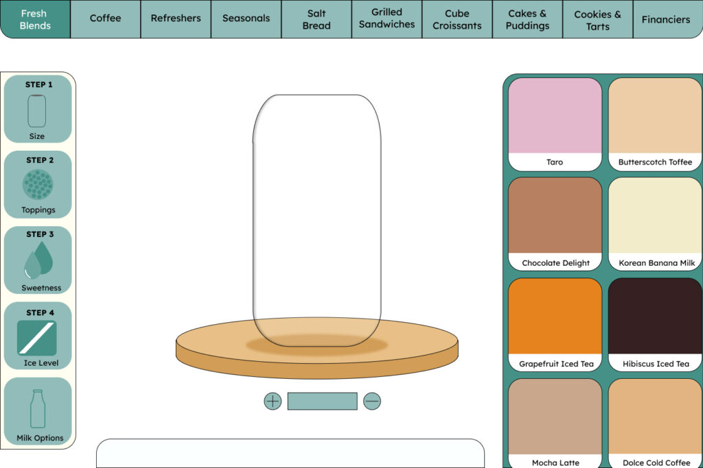
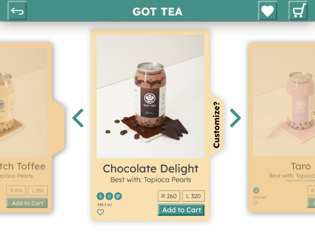
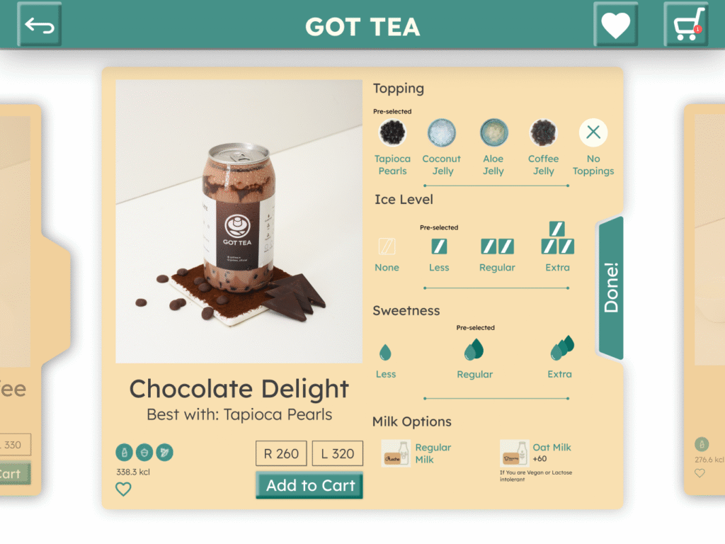
Tappable Card based Layout (Main Interface)
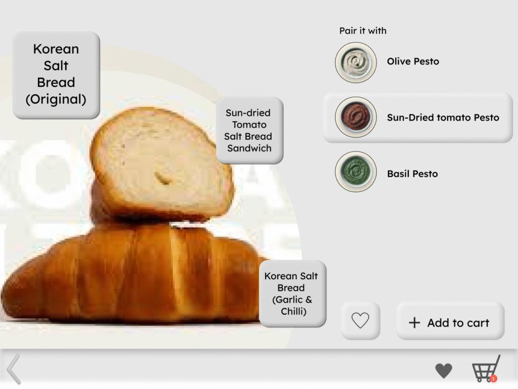
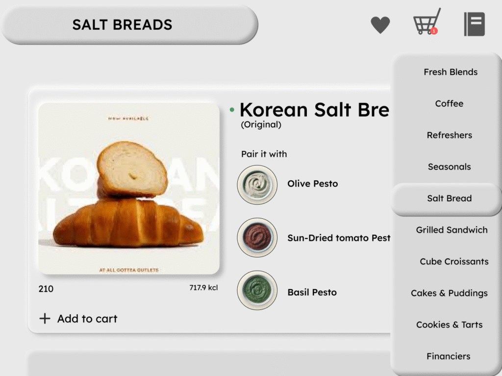
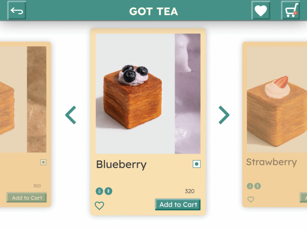
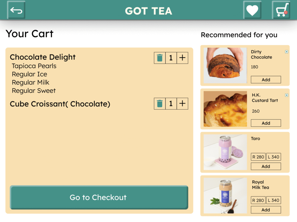
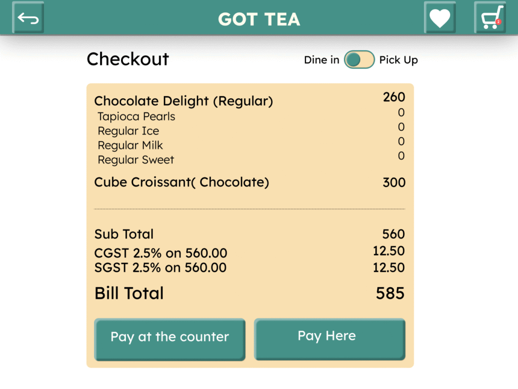
The main interface is a clean, card-based layout – great for quick, structured ordering.
Instead of throwing a long list of items at the user, it lets them focus on one decision at a time: base, toppings, sweetness, etc
Key Element: A modular card layout displaying each drink and food item as a tactile, scrollable card with key info upfront. The design emphasizes visual hierarchy, accessibility, and ease of comparison.
Learning: simple enough for first-timers, yet brand-aligned to Got Tea’s aesthetic.
Design Process
